MA.6.DP.1.5

Examples
The numerical data set {15,0,32,24,0,17,42,0,29,120,0,20}, collected based on minutes spent on homework, can be represented graphically using a box plot.
Clarifications
Clarification 1: Instruction includes collecting data and discussing ways to collect truthful data to construct graphical representations.
Clarification 2: Within this benchmark, it is the expectation to use appropriate titles, labels, scales and units when constructing graphical representations.
Clarification 3: Numerical data is limited to positive rational numbers.
Alternate version of this benchmark for students with significant cognitive disabilities.
Connecting Benchmarks/Horizontal Alignment
Terms from the K-12 Glossary
- Box Plot
- Data
- Histogram
Vertical Alignment
Previous Benchmarks
Next Benchmarks
Purpose and Instructional Strategies
In grade 5, students collected and represented numerical data using tables, line graphs or line plots and interpreted this data by determining the mean, median, mode and range. In grade 6, students add box plots and histograms to the types of data displays they are creating. In grade 7, students are asked to choose and create an appropriate graphical representation of both numerical and categorical data, which includes bar graphs and circle graphs (MTR.1.1, MTR.2.1, MTR.7.1).- Instruction includes developing statistical questions that generate numerical data.
- Instruction includes opportunities for students to collect their own data to create a graphical display. This increases student interest in analyzing the data (MTR.1.1).
- Scales can be represented using brackets, ranges, inclusive or exclusive endpoints.
- For example, the numerical data set from the example is {15, 0, 32, 24, 0, 17, 42, 0, 29, 120, 0, 20}. A student has determined to use intervals of 0-20, 20-40, 40-60, 60-80, 80-100, 100-120.
- could use brackets to represent inclusive endpoints and parentheses to represent exclusive endpoints. Students can write the intervals as [0-20); [20-40); [40-60); [60-80); [80-100); [100-120].
- Students can write the intervals as 0-20, 21-40, 41-60, 61-80, 91-100, 101-120 since the data only contains whole numbers.
- It is important to note that students may create intervals (or bins) that do not necessitate the use of these as it is not an issue with the given data set.
- Students should discuss how there could be differences in distributions when the bins of the histograms may vary.
- For example, the numerical data set from the example is {15, 0, 32, 24, 0, 17, 42, 0, 29, 120, 0, 20}. A student has determined to use intervals of 0-20, 20-40, 40-60, 60-80, 80-100, 100-120.
- Given a set of data, allow students to choose to create either a histogram or box plot, ensuring both are being created. Then discuss pros and cons for why one may be preferred over another. Practice this using data sets containing whole numbers as well as with data sets containing positive rational numbers. Students should be provided with different ways to organize the data in order to best create the graphical representation.
- Instruction allows for analysis of the truthfulness or reasonableness of the data set. Students should understand whether the data can be used to showcase real situations.
- Instruction includes the use of online tools to quickly show the difference in distributions when changing the size of the bins in a histogram.
Common Misconceptions or Errors
- Students may choose bin sizes that do not effectively show the distribution of the data.
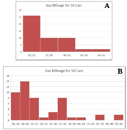
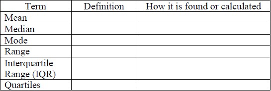
- For example, students gathered gas mileage (in miles per gallon) data for 50 cars as shown in the histograms below. Histogram A easily shows the gas mileage for the majority of cars, and a much smaller count being above 40 miles per gallon. Histogram B uses very small bins which leads the consumer to believe that there is more variability in the data than truly exists.
- For example, students gathered gas mileage (in miles per gallon) data for 50 cars as shown in the histograms below. Histogram A easily shows the gas mileage for the majority of cars, and a much smaller count being above 40 miles per gallon. Histogram B uses very small bins which leads the consumer to believe that there is more variability in the data than truly exists.
- Students may incorrectly include the same number in 2 bins. For example, if bins are 010, 10-20, 20-30, etc., they must decide whether 10 is included in the first bin or if numbers greater than 0, but less than 10 are included in the first bin.
- Students may incorrectly calculate the median given a data set with an even number of values.
- Students may incorrectly believe more data will create a larger box in a box plot.
- Students may neglect to order values from least to greatest when creating a box plot.
- Students may neglect to include titles and labels in the graphical representations.
Strategies to Support Tiered Instruction
- Teacher reviews the difference between histograms and bar graphs, creating an anchor chart with properties of a histogram for students to refer to.
- Teacher reinforces how scales are represented with specific endpoints. The endpoints they chose to use, or as defined in a problem, tell them if the point is included in the bin or not. Include notation of endpoints on anchor chart to display in the classroom.
- If there are an even number of total data points, teacher models how the median is found by finding the mean of the two middle data points. Teachers provide opportunities for students to practice this skill by gradually releasing them until they are proficient and gain understanding.
- Teacher co-creates s vocabulary guide/anchor chart with students who need additional support understanding the vocabulary for measures of center and variation.
- Examples of guides and charts are shown below.
- Examples of guides and charts are shown below.
Instructional Tasks
Instructional Task 1 (MTR.3.1, MTR.7.1)Data from the International Shark Attack File on the number of shark attacks in Florida is given in the table below.
- Part A. Construct a box plot to summarize this data.
- Part B. Identify and explain what each of the key numbers you used to make the box plot means in the context of the data.
- Part C. Describe the distribution of the number of shark attacks in Florida between 2001 and 2013. Be sure to describe the spread and distribution of the data.
Below are the 25 birth weights, in ounces, of all the Labrador Retriever puppies born at Kingston Kennels in the last six months.
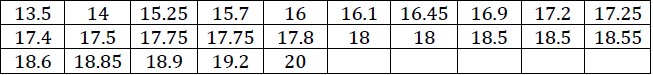
- Part A. Use a box plot or histogram to summarize these birth weights and explain how you chose which type of graph to use.
- Part B. Describe the distribution of birth weights for puppies born at Kingston Kennels in the last six months. Be sure to describe the spread and distribution of the data.
- Part C. What is a typical birth weight for puppies born at Kingston Kennels in the last six months? Explain why you chose this value.
Instructional Items
Instructional Item 1Every year a local basketball team plays 82 games. During the past two decades, the number of wins each year was:
*The strategies, tasks and items included in the B1G-M are examples and should not be considered comprehensive.
General Information
Subject Area: Mathematics (B.E.S.T.)
Grade: 6
Strand: Data Analysis and Probability
Date Adopted or Revised: 08/20
Status: State Board Approved
This benchmark is part of these courses.