


Remarks
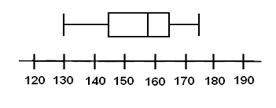
Example: Alfonso's bowling scores are 125, 142, 165, 138, 176, 102, 156, 130, and 142. Make a box-and-whiskers plot of the data.
The box and whiskers plot below represents the bowling scores of Anna. Compare the bowling scores of Alfonso and Anna. Who is a better bowler?
-
Item Type(s):
This benchmark may be assessed using:
MC
item(s)
- Clarification :
Students will interpret data displayed in box-and-whisker plots, scatter plots, and lines of best fit and make conjectures.
Students will select the best display for a given data set.
Students will select the explanation that expresses the appropriate interpretation of the given data.
- Content Limits :
Data sets used in items should be limited to a maximum of 12 data points and three categories for all graphic displays except for scatter plots and lines of best fit.
Graphic displays may include line graphs, line plots, pictographs, single/multiple-bar graphs, circle graphs, stem-and-leaf plots/tables, histograms, box-and-whisker plots, scatter plots, and lines of best fit.
Items should have no more than two box-and-whisker plots from which to interpret data.
- Stimulus Attributes :
Items may ask students to use statistics to interpret and analyze real-world situations.
All items should be set in a real-world context.
Graphics should be used in all of these items.
Items will use the terms first quartile and third quartile instead of lower quartile and upper quartile.
- Test Item #: Sample Item 1
- Question: The table below shows a professional baseball player’s statistics for “Runs Batted In” (RBI) from 1998 through 2004.

Which of the following box-and-whisker plots best represents the RBI data shown in the table?
- Difficulty: N/A
- Type: MC: Multiple Choice
Related Access Points
Related Resources
Lesson Plan
Teaching Idea
Virtual Manipulatives
Student Resources
Virtual Manipulatives
This is an online graphing utility that can be used to create box plots, bubble graphs, scatterplots, histograms, and stem-and-leaf plots.
Type: Virtual Manipulative
With a mouse, students will drag data points (with their error bars) and watch the best-fit polynomial curve form instantly. Students can choose the type of fit: linear, quadratic, cubic, or quartic. Best fit or adjustable fit can be displayed.
Type: Virtual Manipulative
Users select a data set or enter their own data to generate a box plot.
Type: Virtual Manipulative
This manipulative allows the user to enter multiple coordinates on a grid, estimate a line of best fit, and then determine the equation for a line of best fit.
Type: Virtual Manipulative