


Clusters should not be sorted from Major to Supporting and then taught in that order. To do so would strip the coherence of the mathematical ideas and miss the opportunity to enhance the major work of the grade with the supporting clusters.
- Assessment Limits :
Numbers in items must be rational numbers. Trend/association is based on visual inspection. Line of best fit must be informally assessed. Trend/association must be linear. - Calculator :
Neutral
- Context :
Allowable
- Test Item #: Sample Item 1
- Question:
A scatter plot is shown.
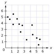
Use the Add Arrow tool to draw a line of best fit for the scatter plot.
- Difficulty: N/A
- Type: GRID: Graphic Response Item Display
- Test Item #: Sample Item 2
- Question:
Which graph represents the line of best fit for the scatter plot?
- Difficulty: N/A
- Type: MC: Multiple Choice
Related Courses
Related Access Points
Related Resources
Formative Assessments
Lesson Plans
Original Student Tutorials
Perspectives Video: Professional/Enthusiasts
Problem-Solving Tasks
Student Center Activity
Teaching Idea
Tutorial
Video/Audio/Animations
Virtual Manipulatives
STEM Lessons - Model Eliciting Activity
Students will apply skills (making a scatter plot, finding Line of Best Fit, finding an equation and predicting the y-value of a point on the line given its x-coordinate) to a fuel efficiency problem and then consider other factors such as color, style, and horsepower when designing a new coupe vehicle.
Model Eliciting Activities, MEAs, are open-ended, interdisciplinary problem-solving activities that are meant to reveal students’ thinking about the concepts embedded in realistic situations. Click here to learn more about MEAs and how they can transform your classroom.
MFAS Formative Assessments
Students are asked to informally fit a line to model the relationship between two quantitative variables and to assess how well that line fits the data.
Students are asked to informally fit a line to model the relationship between two quantitative variables and to assess how well that line fits the data.
Students are asked to informally assess three lines fitted to data to determine which fit is the best.
Students are asked to compare two lines fitted to data to determine which fit is better.
Original Student Tutorials Mathematics - Grades 6-8
Explore informally fitting a trend line to data graphed in a scatter plot in this interactive online tutorial.
This is part 3 in 6-part series. Click below to open the other tutorials in the series.
Learn how to write the equation of a linear trend line when fitted to bivariate data in a scatterplot in this interactive tutorial.
This is part 4 in 6-part series. Click below to open the other tutorials in the series.
Student Resources
Original Student Tutorials
Learn how to write the equation of a linear trend line when fitted to bivariate data in a scatterplot in this interactive tutorial.
This is part 4 in 6-part series. Click below to open the other tutorials in the series.
- Scatterplots Part 1: Graphing
- Scatterplots Part 2: Patterns, Associations and Correlations
- Scatterplots Part 3: Trend Lines
- Scatterplots Part 5: Interpreting the Equation of the Trend Line
- Scatterplots Part 6: Using Linear Models
Type: Original Student Tutorial
Explore informally fitting a trend line to data graphed in a scatter plot in this interactive online tutorial.
This is part 3 in 6-part series. Click below to open the other tutorials in the series.
- Scatterplots Part 1: Graphing
- Scatterplots Part 2: Patterns, Associations and Correlations
- Scatterolots Part 4: Equation of the Trend Line
- Scatterplots Part 5: Interpreting the Equation of the Trend Line
- Scatterplots Part 6: Using Linear Models
Type: Original Student Tutorial
Student Center Activity
Students can practice answering mathematics questions on a variety of topics. With an account, students can save their work and send it to their teacher when complete.
Type: Student Center Activity
Tutorial
Scatterplots are used to visualize the relationship between two quantitative variables in a binary relation. As an example, trends in the relationship between the height and weight of a group of people could be graphed and analyzed using a scatter plot.
Type: Tutorial
Video/Audio/Animations
This 5-minute video provides an example of how to solve a problem using a trend line to estimate data through a problem called, "Smoking in 1945."
Type: Video/Audio/Animation
Khan Academy tutorial video that demonstrates with real-world data the use of Excel spreadsheet to fit a line to data and make predictions using that line.
Type: Video/Audio/Animation
Virtual Manipulatives
Using this virtual manipulative, students are able to graph a function and a set of ordered pairs on the same coordinate plane. The constants, coefficients, and exponents can be adjusted using slider bars, so the student can explore the affect on the graph as the function parameters are changed. Students can also examine the deviation of the data from the function. This activity includes supplemental materials, including background information about the topics covered, a description of how to use the application, and exploration questions for use with the java applet.
Type: Virtual Manipulative
With a mouse, students will drag data points (with their error bars) and watch the best-fit polynomial curve form instantly. Students can choose the type of fit: linear, quadratic, cubic, or quartic. Best fit or adjustable fit can be displayed.
Type: Virtual Manipulative
This manipulative allows the user to enter multiple coordinates on a grid, estimate a line of best fit, and then determine the equation for a line of best fit.
Type: Virtual Manipulative
Parent Resources
Teaching Idea
In this task, students start by examining a scatter plot about the size of various bird eggs from a collection of measurements. In particular, students are asked to identify a correlation, sketch an approximation for the line of best fit, determine the equation of that line, use the equation of the line and/or the graph to make interpolative predictions, and draw conclusions about the properties of specific eggs by using the graphical presentation of the data.
Type: Teaching Idea
Video/Audio/Animation
Khan Academy tutorial video that demonstrates with real-world data the use of Excel spreadsheet to fit a line to data and make predictions using that line.
Type: Video/Audio/Animation