MA.6.DP.1.3

Examples
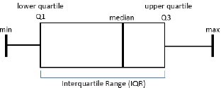
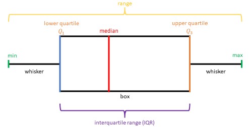
The middle 50% of the population can be determined by finding the interval between the upper quartile and the lower quartile.
Clarifications
Clarification 1: Instruction includes describing range, interquartile range, halves and quarters of the data.
Alternate version of this benchmark for students with significant cognitive disabilities.
Connecting Benchmarks/Horizontal Alignment
Terms from the K-12 Glossary
- Box Plot
- Data
- Interquartile Range (IQR)
- Median
- Quartiles
- Range (of a data set)
Vertical Alignment
Previous Benchmarks
Next Benchmarks
Purpose and Instructional Strategies
In grade 5, students collected and represented fraction and decimal data using tables, line graphs or line plots. They also interpreted whole-number data by determining the mean, median, mode or range. In grade 6, students will be given a box plot in a real-world context to determine quartile values as well as describe the spread and distribution. In grade 7, students will then use the measures of center and variability to make comparisons, interpret results and draw conclusions about two populations (MTR.7.1).- Instruction includes developing statistical questions that generate numerical data. .
- Box plots represent only numerical data sets and display the data’s spread.
- Instruction focuses more on variation rather than measures of central tendency..
- Vocabulary focuses more on variation rather than measures of central tendency.
- Instruction focuses on the advantages and disadvantages of box plots in relation to other graphical representations.
- Instruction relates to MA.6.DP.1.5 in which students will create box plots to represent sets of numerical data.
- Instruction includes horizontal and vertical representations of box plots (MTR.2.1).
- Instruction provides opportunities for students to use the following terms interchangeably (MTR.4.1).
- lower quartile (LQ), quartile 1 (Q1) and the boundary for the lowest 25% of the data set
- median and quartile 2 (Q2)
- upper quartile (UQ), quartile 3 (Q3) and the boundary for the highest 25% of the data set
- interquartile range (IQR) and the middle 50% of the data set
Common Misconceptions or Errors
- Students may have difficulty remembering what percentage of data is above or below the specific quartile (e.g., 25% below LQ, 50% below/above median, 25% above UQ, etc.)
- Students may have difficulty determining the median of an even set of data.
- Students may incorrectly believe the median always splits the box portion of a box plot in half.
Strategies to Support Tiered Instruction
- Teacher reviews vocabulary for students who have difficulty understanding what percentage of data is above or below the specific quartile. Students should be given opportunity to relate “quartile” to “quarter.” Teachers can ensure students understand that “quartile” means 25% and recognize the median as “middle” of the data.
- If there are an even number of total data point, teacher models how the median is found by finding the mean of the two middle data points. Teacher provides opportunity for students to practice this skill by gradually releasing them until they are proficient and gain understanding.
- Teacher co-creates s vocabulary guide or anchor chart with students who need additional support understanding the vocabulary for measures of center and variation.
- Examples of guides and charts are shown below.
- Examples of guides and charts are shown below.
Instructional Tasks
Instructional Task 1 (MTR.5.1)Use the data from the International Shark Attack File on the number of shark attacks in Florida, which is given in the table below, along with the corresponding box plot to answer the following questions.
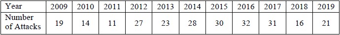
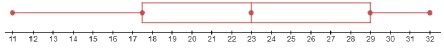
- Part A. When did the most number of shark attacks occur? When did the lowest number of shark attacks occur? Why do you think this was the case?
- Part B. What is the median number of shark attacks?
- Part C. What percentage of attacks was below 30?
Instructional Items
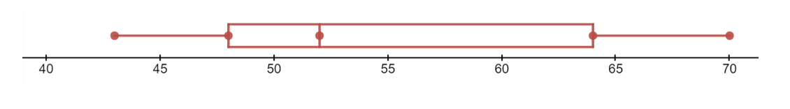
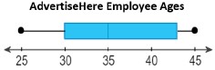
Instructional Item 1The box plot represents the AdvertiseHere company employees’ ages. State the lowest age, lower quartile age, median age, upper quartile age and highest age of the employees.
*The strategies, tasks and items included in the B1G-M are examples and should not be considered comprehensive.
General Information
Subject Area: Mathematics (B.E.S.T.)
Grade: 6
Strand: Data Analysis and Probability
Date Adopted or Revised: 08/20
Status: State Board Approved
This benchmark is part of these courses.