
General Information
Subject Area: Mathematics (B.E.S.T.)
Grade: 912
Strand: Data Analysis and Probability
Date Adopted or Revised: 08/20
Status: State Board Approved
Benchmark Instructional Guide
Connecting Benchmarks/Horizontal Alignment
Terms from the K-12 Glossary
- Bivariate data
- Cluster (data)
- Line of fit
- Quadratic function
- Scatterplot
- -intercept
- -intercept
Vertical Alignment
Previous Benchmarks
Next Benchmarks
Purpose and Instructional Strategies
In grade 8, students work with scatterplots and lines of fit. In Math for Data and Financial Literacy, students work with bivariate numerical data that suggests a quadratic association and interpret the intercepts or the vertex of the model as it relates to a real-world context.- In this benchmark, students are fitting a quadratic function to numerical bivariate data, interpreting the intercepts and vertex based on the context and using that quadratic function to make predictions about values that correspond to parts of the graph that lie beyond or within the scatter plot.
- Instruction makes the connection to relevant, real-world applications such as discretionary expenses, consumer credit, automobile ownership, employment, taxes, independent living, the stock market, business relations, planning for retirement, budgeting, current events, etc. (MTR.7.1).
- Instruction includes the use of technology for students to understand the difference between a curve of fit and a curve of best fit.
- During instruction it is important to distinguish the difference between a “curve of fit” and the “curve of best fit.”
- A “curve of fit” is used when students are visually investigating numerical bivariate data that appears to have a non-linear relationship and can sketch a line or curve (using a writing instrument and straightedge) that appears to “fit” the data. Using this “curve of fit” students can estimate its vertex and intercepts and use that information to interpret the context of the data.
- The “curve of best fit” is used when the data is further analyzed using regression calculations (the process of minimizing the squared distances from the individual data values to the line), often done with the assistance of technology.
Common Misconceptions or Errors
- Students may not know how to sketch a curve of fit.
- For example, they may always go through the first and last points of data.
- Students may confuse the two variables when interpreting the data as related to the context.
- Students may have trouble interpreting the vertex and intercepts in relation to the context of the problem.
- Students may not know the difference between interpolation (predictions within a data set) and extrapolation (predictions beyond a data set).
- Students may need assistance working with spreadsheets, calculators or other types of technology as it relates to data.
Instructional Tasks
Instructional Task 1 (MTR.4.1, MTR.7.1)- A study was done to compare the speed (in miles per hour) with the mileage (in miles per gallon) of a car with a specific make and model. The results are shown in the table below.
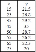
- Part. A. Create a scatterplot of the data.
- Part B. Sketch a line of fit for the data. Interpret the vertex and any intercepts in the context of the data.
- Part C. Using your line of fit, estimate the mileage when the car is traveling at a speed of 60 miles per hour.
- Part D. Use technology to find a model that best fits the data.
- Part E. Use the model to predict the mileage of the car when the car is traveling at a speed of 60 miles per hour. How close was your prediction to the model’s prediction?
Instructional Items
Instructional Item 1- The graph below represents the gas mileage, in miles per gallon, of a car at different speeds.
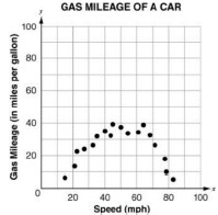
- If denotes the speed and denotes the mileage per gallon, which equation best represents the relationship between the speed of the car and fuel efficiency?
a. = 0.0252 − 2.5 − 25
b. = 0.0252 + 2.5 + 25
c. = −0.0252 + 2.5 + 25
d. = −0.0252 + 2.5 − 25