
General Information
Subject Area: Mathematics (B.E.S.T.)
Grade: 912
Strand: Data Analysis and Probability
Date Adopted or Revised: 08/20
Status: State Board Approved
Benchmark Instructional Guide
Connecting Benchmarks/Horizontal Alignment
Terms from the K-12 Glossary
- Association
- Bivariate data
- Line of fit
- Scatter plot
Vertical Alignment
Previous Benchmarks
Next Benchmarks
Purpose and Instructional Strategies
In grade 8, students constructed scatter plots and informally fit a straight line into scatter plots with linear associations. Association in a scatter plot was described as positive/negative, linear/nonlinear and strong/weak. In Mathematics for College Statistics, students continue to describe the correlation, or association, among the numerical bivariate data using the correlation coefficient to assist in determining direction and the size of the residuals to aid in describing the strength.- In MA.912.DP.2.6, students use the scatter plot, residuals and slope to describe the strength and trend of the linear model. This benchmark expands on those ideas using the correlation coefficient.
- Instruction relies on using technology to calculate the correlation coefficient. Using a formula can be quite tedious, and may rely upon calculations that students are not familiar with at this point in their learning.
- This benchmark is only meant to address linear models.
- Instruction emphasizes the correlation coefficient, or , is always between −1 and 1. A perfect positive linear association has a correlation coefficient of 1; a perfect negative linear association has correlation coefficient of −1. Weaker relationships have correlations that are closer to 0.
- Instruction emphasizes that the sign of the correlation coefficient corresponds to the direction/trend of the scatter plot and the sign of the slope. It should also be noted that the sign of the correlation coefficient does not affect the strength of the correlation.
- While there are not an agreed upon set of boundaries when classifying the strength of a correlation, it may be helpful to set up guidelines for students.
- For example, a statistics course may generally teach that if || ≥ .80 then the relationship is strong, if .50 ≤ || ≤ .79 then the relationship is moderately strong, and if || ≤ .49 then the relationship is weak.
- Instruction includes describing the direction of the correlation as positive or negative and the strength of the correlation as strong, possibly moderate or weak. It should be mentioned that the formal name of this computation is Pearson’s correlation coefficient, and it is used to measure the strength and direction of linear models. However, there are other calculations that exist for measuring the strength of nonlinear models.
Common Misconceptions or Errors
- Students may incorrectly assume that the sign of the correlation has an effect on the strength.
- Students may have issues comparing the decimal values of correlation coefficients.
- Students may have trouble rounding decimals or rounding to the correct decimal place.
Instructional Tasks
Instructional Task 1 (MTR.6.1, MTR.7.1)- The strongest hurricanes from 2010 to 2019 were studied, and the central pressure (mb) and maximum wind speed (kt) were recorded and are given in the table below.

- Part A. Use technology to create a scatter plot, and use the graph to estimate the correlation coefficient.
- Part B. Use technology to calculate the correlation coefficient.
- Part C. Describe the direction of the correlation coefficient.
- Part D. Describe the strength of the correlation coefficient.
- Part E. How does your estimate in Part A compare to the calculation in Part B?
- Part F. Use technology to find the line of best fit. Do you feel the linear model is appropriate based on the graph and the correlation coefficient? Justify your reasoning.
Instructional Items
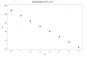
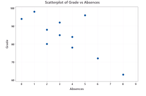
Instructional Item 1- Match the correlation coefficient with the appropriate scatter plot.
- = -1
- = .94
- = -.75
- = .11
Scatter plot A Scatter plot B
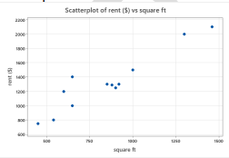
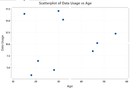
Scatter plot C Scatter plot D
Instructional Item 2
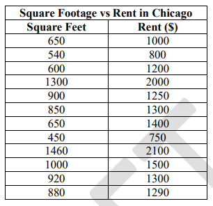
- Use technology to calculate the correlation coefficient of the data set. Interpret the direction and strength.
*The strategies, tasks and items included in the B1G-M are examples and should not be considered comprehensive.