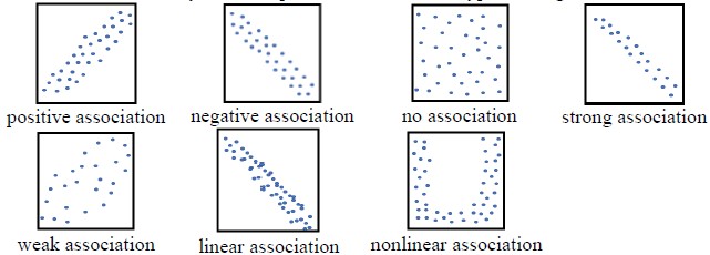
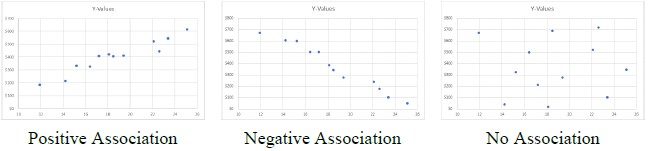
Given a scatter plot within a real-world context, describe patterns of association.
Descriptions include outliers; positive or negative association; linear or nonlinear association; strong or weak association.
| Name |
Description |
| Why Correlations? | This lesson is an introductory lesson to correlation coefficients. Students will engage in research prior to the teacher giving any direct instruction. The teacher will provide instruction on how to find the correlation coefficient by hand and using Excel. |
| Why Correlations? | This lesson is an introductory lesson to correlation coefficients. Students will engage in research prior to the teacher giving any direct instruction. The teacher will provide instruction on how to find the correlation coefficient by hand and using Excel. |
| Clean Up, Collect Data, and Conserve the Environment! | Students will participate in collecting trash either on campus or another location. They will compare the distance traveled and the weight of the trash bag collected. Students will explore the use of mean and median in finding the ratios of the data set. They will discuss the use of mean and median in finding the relationship between the independent and dependent variables. Students will examine their scatter plot and determine if any patterns of association exist. They will compare their data to a coastal cleanup report. Finally, students will use the data to help determine interventions at the local, state and national level regarding environmental issues. |
| Compacting Cardboard | Students investigate the amount of space that could be saved by flattening cardboard boxes. The analysis includes linear graphs and regression analysis along with discussions of slope and a direct variation phenomenon. |
| A Day at the Park | In this activity, students investigate a set of bivariate data to determine if there is a relationship between concession sales in the park and temperature. Students will construct a scatter plot, model the relationship with a linear function, write the equation of the function, and use it to make predictions about values of variables. |
| You Can Plot it! Bivariate Data | Students create scatter plots, calculate a regression equation using technology, and interpret the slope and y-intercept of the equation in the context of the data. This review lesson relates graphical and algebraic representations of bivariate data. |
| Basketball - it's a tall man's sport - or is it? | The students will use NBA player data to determine if there is a correlation between the height of a basketball player and his free throw percentage. The students will use technology to create scatter plots, find the regression line and calculate the correlation coefficient.
Basketball is a tall man's sport in most regards. Shooting, rebounding, blocking shots - the taller player seems to have the advantage. But is that still true when shooting free throws? |
| Scatter Plots | This lesson is an introduction to scatterplots and how to use a trend line to make predictions. Students should have some knowledge of graphing bivariate data prior to this lesson. |
| Hand Me Your Data | Students will gather and use data to calculate a line of fit and the correlation coefficient with their classmates' height and hand size. They will use their line of fit to make approximations. |
| What Will I Pay? | Who doesn't want to save money? In this lesson, students will learn how a better credit score will save them money. They will use a scatter plot to see the relationship between credit scores and car loan interest rates. They will determine a line of fit equation and interpret the slope and y-intercept to make conclusions about interest and credit scores. |
| What does it mean? | This lesson provides the students with scatter plots, lines of best fit and the linear equations to practice interpreting the slope and y-intercept in the context of the problem. |
| Is My Model Working? | Students will enjoy this project lesson that allows them to choose and collect their own data. They will create a scatter plot and find the line of fit. Next they write interpretations of their slope and y-intercept. Their final challenge is to calculate residuals and conclude whether or not their data is consistent with their linear model. |
| Fit Your Function | Students will make a scatter plot and then create a line of fit for the data. From their graph, students will make predictions and describe relationships between the variables. Students will make predictions, inquire, and formulate ideas from observations and discussions. |
| Star Scatter Plots | In this lesson, students plot temperature and luminosity data from a provided star table to create a scatter plot. They will analyze the data to sequence the colors of stars from hottest to coolest and to describe the relationship between temperature and luminosity. This lesson does not address differentiation between absolute and apparent magnitude. |
| Scatter Plots and Correlations | Students create scatter plots, and lines of fit, and then calculate the correlation coefficient. Students analyze the results and make predictions. This lesson includes step-by-step directions for calculating the correlation coefficient using Excel, GeoGebra, and a TI-84 Plus graphing calculator. Students will make predictions for the number of views of a video for any given number of weeks on the charts. |
| Text Count and Homework Minutes | Text Count and Homework Minutes
The Students will engage in counting Text minutes and Homework minutes. They will keep a journal to be kept over a four day period, Monday thru Thursday. The assignment can be done on Friday. The students will record the number of text messages received and sent out during the hours of 3:00-11:00. On the second journal the students will also record the number of minutes spent on homework between the hours of 3:00-11:00. They will compile this information into graphs on that 5th day Friday. With this data the students will be able to plot a scatter plot graph and learn how to recognize patterns on a scatter plot graph. Students will see the relevance of a correlation even if the graph is not linear or a straight line. Students will identify trends and articulate the reason for the trends. |
| Scattered Time | Through a slide show presentation, students will be led through data in one variable, bivariate data, scatter plots, lines of best fit, outliers, and correlations. They will be able to analyze bivariate data to determine correlations, associations, and the impact of outliers. |
| If the line fits, where's it? | In this lesson students learn how to informally determine a "best fit" line for a scatter plot by considering the idea of closeness. |
| Scatter Plots at Arm's Reach | This lesson is an introductory lesson to scatter plots and line of best fit (trend lines). Students will be using small round candy pieces to represent different associations in scatter plots and measure each other's height and arm span to create their own bivariate data to analyze. Students will be describing the association of the data, patterns of the data, informally draw a line of best fit (trend line), write the equation of the trend line, interpret the slope and y-intercept, and make predictions. |
| Doggie Data: It's a Dog's Life | Students use real-world data to construct and interpret scatter plots using technology. Students will create a scatter plot with a line of fit and a function. They describe the relationship of bivariate data. They recognize and interpret the slope and y-intercept of the line of fit within the context of the data. |
| Scrambled Coefficient | Students will learn how the correlation coefficient is used to determine the strength of relationships among real data. Students use card sorting to order situations from negative to positive correlations. Students will create a scatter plot and use technology to calculate the line of fit and the correlation coefficient. Students will make a prediction and then use the line of fit and the correlation coefficient to confirm or deny their prediction.
Students will learn how to use the Linear Regression feature of a graphing calculator to determine the line of fit and the correlation coefficient.
The lesson includes the guided card sorting task, a formative assessment, and a summative assessment. |
| Spaghetti Trend | This lesson consists of using data to make scatter plots, identify the line of fit, write its equation, and then interpret the slope and the y-intercept in context. Students will also use the line of fit to make predictions. |
| Help, My Data is Scattered!!! | This lesson provides activities for students to conceptually understand how to gather, organize, and interpret data using a scatter plot. They will be required to work cooperatively to complete certain tasks. They will use estimation strategies to complete a experiment that compares the the length of their hand to the number of centimeter cubes they can grab in order to make predictions about data with a larger sample size. Students will be assessed formally and informally throughout lesson via slide notes and data collection tool. |
| Where do I fit in? | Students will do an exploration activity with paper airplanes. They will be up and moving around. Students will be able to understand and analyze bivariate data that they will be able to plot from the exploration activity. They will be able to describe patterns, and also find facts and come up with conclusions based on the data they gather. |
| How technology can make my life easier when graphing | Students will use GeoGebra software to explore the concept of correlation coefficient in graphical images of scatter plots. They will also learn about numerical and qualitative aspects of the correlation coefficient, and then do a matching activity to connect all these representations of the correlation coefficient. They will use an interactive program file in GeoGebra to manipulate the points to create a certain correlation coefficient. Step-by-step instructions are included to create the graph in GeoGebra and calculate the r correlation coefficient. |
| What's Your Association: Scatter Plots and Bivariate Data | Students will graph, describe, and determine patterns of associations for bivariate data. This lesson incorporates vocabulary development and collaboration. |
| How Heavy is Your Lineman | This lesson will get your student up to speed with constructing and interpreting scatter plots using bivariate data. With this lesson, patterns of association are investigated between two quantities and positive or negative association as well as linear and non-linear association is determined through the use of data from the NFL as reported by ESPN. Data from Consumer Reports is used to determine associations between shoe price and quality. |
| Slope and y-Intercept of a Statistical Model | Students will sketch and interpret the line of fit and then describe the correlation of the data. Students will determine if there’s a correlation between foot size and height by collecting data. |
| Line of Fit | Students will graph scatterplots and draw a line of fit. Next, students will write an equation for the line and use it to interpret the slope and y-intercept in context. Students will also use the graph and the equation to make predictions. |
| Finding the Hottest Trend | In this lesson, students will graph a scatter plot and learn how to recognize patterns. The students will learn that correlation may still exist even though the points are not in a perfectly straight line (linear function). Students will be able to identify outliers, describe associations, and justify their reasoning. |
| Why Correlations? | This lesson is an introductory lesson to correlation coefficients. Students will engage in research prior to the teacher giving any direct instruction. The teacher will provide instruction on how to find the correlation coefficient by hand and using Excel. |
| Guess the Celebrities' Heights! | In this activity, students use scatter plots to compare the estimated and actual heights of familiar celebrities and athletes. They will determine how their answers impact the correlation of their data, including the influence of outliers. Finally, they will compare their correlation to that provided in a scatter plot with a larger data sample. |
| Scatter plots, spaghetti, and predicting the future | Students will construct a scatter plot from given data. They will identify the correlation, sketch an approximate line of fit, and determine an equation for the line of fit. They will explain the meaning of the slope and y-intercept in the context of the data and use the line of fit to interpolate and extrapolate values. |