
General Information
Benchmark Instructional Guide
Connecting Benchmarks/Horizontal Alignment
Terms from the K-12 Glossary
- Cluster
- Data
- Histogram
- Line Plot
- Outlier
- Range
Vertical Alignment
Previous Benchmarks
Next Benchmarks
Purpose and Instructional Strategies
In grade 5, students interpreted numerical data from tables and line plots by determining the mean, median, mode and range. In grade 6, students extend their understanding of data interpretation by describing qualitatively the symmetry, skewness, gaps, clusters and outliers of line plots and histograms. Additionally, students will expand from whole-number data sets to rational-number data sets and to include histograms as a graphical representation. In grade 7, students compare two data sets to interpret and draw conclusions about populations.- Instruction includes developing statistical questions that generate numerical data.
- Instruction includes the understanding that line plots are useful for highlighting clusters, gaps and outliers within a data set and show the shape of the distribution of a data set while displaying the individual data points. Likewise, students should understand that histograms are useful for highlighting clusters and gaps and shows the shape of the distribution of a data set without displaying the individual data points. Additionally, histograms help identify the shape and spread of the data set.
- Problem types include using a histogram’s or line plot’s symmetry, skewness, gap(s), cluster(s), outlier(s) or range to qualitatively describe the spread/distribution; qualitatively interpret the spread/distribution; or both qualitatively describe and interpret the spread/distribution.
- Instruction relates to MA.6.DP.1.5 in which students create histograms to represent sets of numerical data.
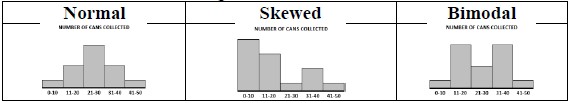
- When describing the distribution, students are not expected to use the term uniform. Instruction focuses on describing data as normal, skewed or bimodal.
- Within this benchmark, the expectation is not to identify skewness as positive, negative, left or right. Students are only expected to describe and interpret skewness within a data set generally. When describing spread of the distribution, students should be able to interpret whether the data set has a narrow range (less spread), wide range (more spread) or contains an outlier (MTR.4.1).
Common Misconceptions or Errors
- Students may confuse bar graphs (categorical data) and histograms (numerical data).
- Students have difficulty understanding skewness and how that relates to data and its interpretation.
Strategies to Support Tiered Instruction
- Teacher displays histograms and line plots, side by side and discusses with students by comparing and contrasting each one to assist students in understanding the difference between the two, and what information can be interpreted from each one.
- Teacher facilitates discussion on symmetry, skewness, gaps, clusters, outliers, and range with students, providing instruction when needed. Teacher provides additional examples for students to reference after instruction.
- Teacher displays a graph or other visual representation to show a real-world example will assist in students seeing data that is skewed.
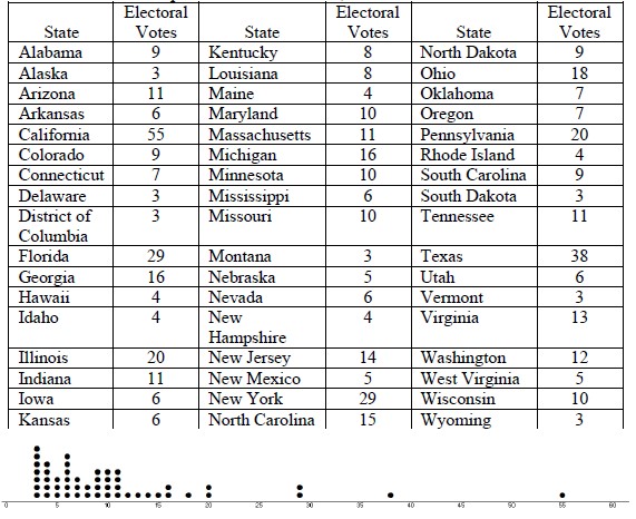
- For example, showing a dot plot of the number of Electoral Votes states have will show data that is skewed. Then conversations can be had about what it means that most of the data points are to the left, and which states have the most votes.
- For example, showing a dot plot of the number of Electoral Votes states have will show data that is skewed. Then conversations can be had about what it means that most of the data points are to the left, and which states have the most votes.
Instructional Tasks
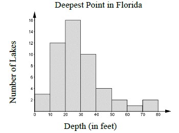
Instructional Task 1 (MTR.4.1)Provide students, either individually or whole group, the histogram below. Have the students slowly and closely observe the graphical representation for 2 minutes. While the students are doing this, have them write down as many observations and wonderings of the graph as they can. Have students share their thinking with a partner. Then as a class, create a cohesive description and interpretation of the histogram.
Instructional Task 2 (MTR.4.1)
The data set {3.25, 2.25, 0.5, 1.5, 1, 0.75, 4, 1, 2.25, 2, 1.5, 1.5, 0.75, 3, 4, 2} is the result of LaKeesha taking a survey of her class to find out how many hours each student spent on their phones on Tuesday. Describe the distribution by stating its symmetry, its range, any outliers, any clusters and any gaps.
Instructional Items
Instructional Item 1The line plot below shows the distribution of test scores in Mrs. Duncan’s math class.
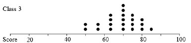
- Part A. Describe the shape of the distribution. What does the shape of the distribution indicate about how students scored on the math test?
- Part B. Describe the spread by using the range and explain what the shape means in terms of the students’ scores on the math test.
*The strategies, tasks and items included in the B1G-M are examples and should not be considered comprehensive.