Standard #: MA.6.DP.1.3


This document was generated on CPALMS - www.cpalms.org


Given a box plot within a real-world context, determine the minimum, the lower quartile, the median, the upper quartile and the maximum. Use this summary of the data to describe the spread and distribution of the data.


Examples


The middle 50% of the population can be determined by finding the interval between the upper quartile and the lower quartile.

Clarifications


Clarification 1: Instruction includes describing range, interquartile range, halves and quarters of the data.

General Information

Subject Area: Mathematics (B.E.S.T.)
Grade: 6
Strand: Data Analysis and Probability
Status: State Board Approved

Benchmark Instructional Guide

Connecting Benchmarks/Horizontal Alignment


Terms from the K-12 Glossary

  • Box Plot
  • Data
  • Interquartile Range (IQR)
  • Median
  • Quartiles
  • Range (of a data set)


Vertical Alignment

Previous Benchmarks

Next Benchmarks


Purpose and Instructional Strategies

In grade 5, students collected and represented fraction and decimal data using tables, line graphs or line plots. They also interpreted whole-number data by determining the mean, median, mode or range. In grade 6, students will be given a box plot in a real-world context to determine quartile values as well as describe the spread and distribution. In grade 7, students will then use the measures of center and variability to make comparisons, interpret results and draw conclusions about two populations (MTR.7.1). 
  • Instruction includes developing statistical questions that generate numerical data.
  • Box plots represent only numerical data sets and display the data’s spread.
  • Instruction focuses more on variation rather than measures of central tendency.
  • Vocabulary instruction emphasizes qualitative descriptive words such as symmetrical and skewed.
  • Instruction focuses on box plots’ benefits and disadvantages in relation to other graphical representations.
  • Instruction relates to MA.6.DP.1.5 in which students will create box plots to represent sets of numerical data.
  • Instruction includes horizontal and vertical representations of box plots (MTR.2.1).
  • Instruction provides opportunities for students to use the following terms interchangeably (MTR.4.1).
    • lower quartile (LQ), quartile 1 (Q1) and the boundary for the lowest 25% of the data set
    • median and quartile 2 (Q2)
    • upper quartile (UQ), quartile 3 (Q3) and the boundary for the highest 25% of the data set
    • interquartile range (IQR) and the middle 50% of the data set
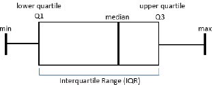
      Interquartile Range (IQR)


Common Misconceptions or Errors

  • Students may have difficulty remembering what percentage of data is above or below the specific quartile (e.g., 25% below LQ, 50% below/above median, 25% above UQ, etc.)
  • Students may have difficulty determining the median of an even set of data.


Strategies to Support Tiered Instruction

  • Teacher reviews vocabulary for students who have difficulty understanding what percentage of data is above or below the specific quartile. Students should be given opportunity to relate “quartile” to “quarter.” Teachers can ensure students understand that “quartile” means 25% and recognize the median as “middle” of the data.
  • If there are an even number of total data point, teacher models how the median is found by finding the mean of the two middle data points. Teacher provides opportunity for students to practice this skill by gradually releasing them until they are proficient and gain understanding.
  • Teacher co-constructs vocabulary guide or anchor chart with students who need additional support understanding the vocabulary for measures of center and variation.
    • Examples of guides and charts are shown below.
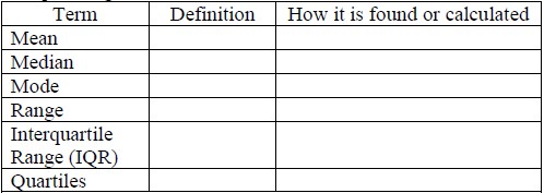
      Table
      Interquartile Range (IQR)


Instructional Tasks

Instructional Task 1 (MTR.5.1)
Use the data from the International Shark Attack File on the number of shark attacks in Florida, which is given in the table below, along with the corresponding box plot to answer the following questions.
Shark Attacks in Florida (2009-2019)
Table
data on a number line
  • Part A. When did the most number of shark attacks occur? When did the lowest number of shark attacks occur? Why do you think this was the case?
  • Part B. What is the median number of shark attacks?
  • Part C. What percentage of attacks was below 30?


Instructional Items

Instructional Item 1
The box plot represents the AdvertiseHere company employees’ ages. State the lowest age, lower quartile age, median age, upper quartile age and highest age.
AdvertiseHere Employee Ages on a number line


*The strategies, tasks and items included in the B1G-M are examples and should not be considered comprehensive.


Related Courses

Course Number1111 Course Title222
1205010: M/J Grade 6 Mathematics (Specifically in versions: 2014 - 2015, 2015 - 2022, 2022 and beyond (current))
1205020: M/J Accelerated Mathematics Grade 6 (Specifically in versions: 2014 - 2015, 2015 - 2020, 2020 - 2022, 2022 and beyond (current))
1204000: M/J Foundational Skills in Mathematics 6-8 (Specifically in versions: 2014 - 2015, 2015 - 2022, 2022 and beyond (current))
7812015: Access M/J Grade 6 Mathematics (Specifically in versions: 2014 - 2015, 2015 - 2018, 2018 - 2022, 2022 and beyond (current))


Related Access Points

Access Point Number Access Point Title
MA.6.DP.1.AP.3 Given a box plot, identify the value of the minimum, the lower quartile, the median, the upper quartile and the maximum.


Related Resources

Formative Assessments

Name Description
Explain Measures of Variability

Students are asked to list measures of variability and explain what they indicate about a set of data.

Analyzing Physical Activity

Students are asked to calculate measures of center and variability, identify extreme values, and interpret the meaning of each in context.

Lesson Plans

Name Description
Using Box Plots and the Mean Absolute Deviation to Interpret Data

This lesson explores the use of box plots and the mean absolute deviation to compare two data sets and draw inferences.

Analyzing Box Plots

This lesson is designed for students to demonstrate their knowledge of box plots.

  • Students will need to create four box plots from given data.
  • Students will need to analyze the data displayed on the box plots by comparing similarities and differences.
  • Students will work with a partner to complete the displays and the follow-up questions.
How tall is an 8th grader?

Ever wonder about the differences in heights between students in grade 8? In this lesson, students will use data they collect to create and analyze multiple box plots using 5-number summaries. Students will make inferences about how height and another category may or may not be related.

Which One: Box plot, Dot Plot, or Histogram?

Students will be asked to obtain data and create a human box plot, which will be analyzed and explained using statistical terms. Students will then understand the differences and advantages to using the box plot, histogram, and dot plot. Students will also practice selecting the most appropriate graphical representation for a set of data.

What's Your Tendency?

This resource can be used to teach students how to create and compare box plots. After completing this lesson, students should be able to answer questions in both familiar and unfamiliar situations.

Which is Better? Using Data to Make Choices

Students use technology to analyze measures of center and variability in data. Data displays such as box plots, line plots, and histograms are used. The effects of outliers are taken into consideration when drawing conclusions. Students will cite evidence from the data to support their conclusions.

How many licks does it take to get to the center?

Students will create different displays, line plots, histograms, and box plots from data collected about types of lollipops. The data will be analyzed and compared. Students will determine "Which lollipop takes the fewest number of licks to get to the center: a Tootsie Pop, a Blow Pop, or a Dum Dum?"

Birthday Party Decisions

Students will create and compare four different boxplots to determine the best location for a birthday party.

Outliers in the Outfield – Dealing With Extreme Data Points

Students will explore the effects outliers have on the mean and median values using the Major League Baseball (MLB) salary statistics. They will create and compare box plots and analyze measures of center and variability. They will also be given a set of three box plots and asked to identify and compare their measures of center and variablity.

Marshmallow Madness

This lesson allows students to have a hands-on experience collecting real-world data, creating graphical representations, and analyzing their data. Students will make predictions as to the outcome of the data and compare their predictions to the actual outcome. Students will create and analyze line plots, histograms, and box plots.

Comparing Data Using Box Plots

Students will use box plots to compare two or more sets of data. They will analyze data in context by comparing the box plots of two or more data sets.

Digging the Plots

Students construct box plots and use the measure(s) of center and variability to make comparisons, interpret results, and draw conclusions about two populations.

Centers, Spreads, and Outliers

The students will compare the effects of outliers on measures of center and spread within dot plots and box plots.

Should Statistics be Shapely?

Students will Interpret differences in shape, center, and spread of a variety of data displays, accounting for possible effects of extreme data points.

Students will create a Human Box Plot using their data to master the standard and learning objectives, then complete interactive notes with the classroom teacher, a formative assessment, and later a summative assessment to show mastery.

Interpreting Box Plots

Students will analyze various real world scenario data sets and create, analyze, and interpret the components of the box plots. Students will use data from morning routines, track times, ages, etc. Lesson includes a PowerPoint, homework, and assessments.

Exploring Box plots

This lesson involves real-world data situations. Students will use the data to create, explore, and compare the key components of a box plot.

The Debate: Who is a Better Baller?

In this activity the students will use NBA statistics on Lebron James and Tim Duncan who were key players in the 2014 NBA Finals, to calculate, compare, and discuss mean, median, interquartile range, variance, and standard deviation. They will also construct and discuss box plots.

Who's Better?--Using Data to Determine

This lesson is intended for use after students are able to construct data plots (histograms, line plots, box plots). Students are tasked with not only constructing data plots, but also matching data plots to data sets. In the summative assessment, students are given two data sets and asked to select which of three data plots (histogram, line plot, or box plot) would best be used to compare the data. After choosing and constructing their plot, students are then tasked with forming a conclusion based on the plots they have constructed.

Advantages and Disadvantages of Dot Plots, Histograms, and Box Plots

Students will compare the advantages and disadvantages of dot plots, histograms, and box plots. During this lesson, students will review the statistical process and learn the characteristics of a statistical question; whether it be numerical or categorical. Students will apply the information learned in a project that involves real-world issues and make an analysis based on the data collected.

Using Box Plots to Interpret Data

This lesson explores the creation of box plots to compare two data sets and draw inferences.

Original Student Tutorial

Name Description
It's Raining....Cats and Dogs

Learn how to make and interpret boxplots in this pet-themed, interactive tutorial.

Teaching Idea

Name Description
Pump Up the Volume

This activity is a statistical analysis of recorded measurements of a single value - in this case, a partially filled graduated cylinder.

Tutorials

Name Description
Shapes of Distributions

In this video, you will practice describing the shape of distributions as skewed left, skewed right, or symmetrical.

Interpreting Box Plots

Students will interpret data presented in a box plot.  

Student Resources

Original Student Tutorial

Name Description
It's Raining....Cats and Dogs:

Learn how to make and interpret boxplots in this pet-themed, interactive tutorial.

Tutorials

Name Description
Shapes of Distributions:

In this video, you will practice describing the shape of distributions as skewed left, skewed right, or symmetrical.

Interpreting Box Plots:

Students will interpret data presented in a box plot.  


Printed On:4/26/2024 10:20:14 PM
Print Page | Close this window