Given a numerical data set within a real-world context, find and interpret mean, median, mode and range.
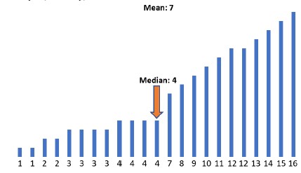
The data set {15,0,32,24,0,17,42,0,29,120,0,20}, collected based on minutes spent on homework, has a mode of 0.
Numerical data is limited to positive rational numbers.
| Name |
Description |
| Climate and Careers! | Students will explore chosen outdoor careers and how the careers connect to certain climates based on temperature and precipitation. The guiding question states "How might you use evidence from weather data and dot plot displays to allow you to identify which location's climate would be best for your career and why?" Students will collect data online and display the data using dot plots on posters with analysis using the mean. Students will engage in collaboration throughout. A power point is included with all necessary resources. |
| Measurement Data Error | In this interdisciplinary lesson, students will practice the skill of data collection with a variety of tools and by statistically analyzing the class data sets will begin to understand that error is inherent in all data. |
| What's My Grade? | "What's My Grade" is a lesson that will focus on a sample student's grades to demonstrate how a final grade is calculated as well as explore possible future grades. Students will create the distributions of each grade category using histograms. They will also analyze grades using mean and standard deviation. Students will use statistics to determine data distribution while comparing the center and spread of two or more different data sets. |
| Plane Statistics | This lesson starts with an activity to gather data using paper airplanes then progresses to using appropriate statistics to compare the center and spread of the data. Box plots are used in this application lesson of concepts and skills previously acquired. |
| The Distance a Coin Will Travel | This lesson is a hands-on activity that will allow students to collect and display data about how far different coins will travel. The data collected is then used to construct double dot plots and double box plots. This activity helps to facilitate the statistical implications of data collection and the application of central tendency and variability in data collection. |
| Which is Better? Using Data to Make Choices | Students use technology to analyze measures of center and variability in data. Data displays such as box plots, line plots, and histograms are used. The effects of outliers are taken into consideration when drawing conclusions. Students will cite evidence from the data to support their conclusions. |
| How long did you study? | Students will create and analyze histograms based on student study time when preparing for the Algebra EOC. Students will be given a set of data and guided notes |
| How many licks does it take to get to the center? | Students will create different displays, line plots, histograms, and box plots from data collected about types of lollipops. The data will be analyzed and compared. Students will determine "Which lollipop takes the fewest number of licks to get to the center: a Tootsie Pop, a Blow Pop, or a Dum Dum?" |
| Outliers in the Outfield – Dealing With Extreme Data Points | Students will explore the effects outliers have on the mean and median values using the Major League Baseball (MLB) salary statistics. They will create and compare box plots and analyze measures of center and variability. They will also be given a set of three box plots and asked to identify and compare their measures of center and variablity. |
| Marshmallow Madness | This lesson allows students to have a hands-on experience collecting real-world data, creating graphical representations, and analyzing their data. Students will make predictions as to the outcome of the data and compare their predictions to the actual outcome. Students will create and analyze line plots, histograms, and box plots. |
| Digging the Plots | Students construct box plots and use the measure(s) of center and variability to make comparisons, interpret results, and draw conclusions about two populations. |
| A Walk Down the Lane | Students will collect data, and create box plots. Students will make predictions about which measurement best describes the spread and center of the data. Students will use this information to make predictions. |
| How Old are the Players? | For this lesson, students will research the ages of players on two basketball teams. They will find the five-number summary, the mean, and determine if there are outliers in the data set. Two box plots will be created and the measures of center and variation analyzed. |
| Centers, Spreads, and Outliers | The students will compare the effects of outliers on measures of center and spread within dot plots and box plots. |
| The Penny Lab | Students will design an investigation to collect and analyze data, determine results, write a justification and make a presentation using U.S. pennies.
Paired student teams will determine the mass of 50 U.S. pennies. Students will also collect other data from each penny such as minted year and observable appearance. Students will be expected to organize/represent their data into tables, histograms and other informational structures appropriate for reporting all data for each penny. Students will be expected to consider the data, determine trends, and research information in order to make a claim that explains trends in data from minted U.S. pennies.
Hopefully, student data reports will support the knowledge that the metallic composition of the penny has changed over the years. Different compositions can have significantly different masses. A sufficiently random selection of hundreds of pennies across the class should allow the students to discover trends in the data to suggest the years in which the composition changed. |
| Homework or Play? | Students will be given data and then plot the data using a graphical method of choice (dot plot, bar graph, box plot, etc.) The students will work in groups and then analyze and summarize the data. |
| Sweet Statistics - A Candy Journey | Students will sort pieces of candy by color and then calculate statistical information such as mean, median, mode, interquartile range, and standard deviation. They will also create an Excel spreadsheet with the candy data to generate pie charts and column charts. Finally, they will compare experimental data to theoretical data and explain the differences between the two. This is intended to be an exercise for an Algebra 1 class. Students will need at least 2 class periods to sort their candy, make the statistical calculations, and create the charts in Excel. |
| Exploring Box plots | This lesson involves real-world data situations. Students will use the data to create, explore, and compare the key components of a box plot. |
| The Debate: Who is a Better Baller? | In this activity the students will use NBA statistics on Lebron James and Tim Duncan who were key players in the 2014 NBA Finals, to calculate, compare, and discuss mean, median, interquartile range, variance, and standard deviation. They will also construct and discuss box plots. |
| Got Homework? | Students will gather data to create dot plots, box plots, and histograms. They will examine each type of graph and compare the different representations. |
| Is It a Guess or Statistics? | This lesson teaches random sampling which leads to making inferences about a larger group or population. Students will determine the best measure of center to use for a data set. Students will collect data, select a data display and then analyze the data. |
| What is a Question? | Students will learn how to recognize and formulate a statistical question. After a statistical question is established, students will engage in collecting data from their classmates. The lesson concludes with student presentations of analyzed data and conclusions about the topic selected. |
| Advantages and Disadvantages of Dot Plots, Histograms, and Box Plots | Students will compare the advantages and disadvantages of dot plots, histograms, and box plots. During this lesson, students will review the statistical process and learn the characteristics of a statistical question; whether it be numerical or categorical. Students will apply the information learned in a project that involves real-world issues and make an analysis based on the data collected. |
| Box Plots | An introduction lesson on creating and interpreting box plots. |
| Basketball All Star Team | In this Model Eliciting Activity, MEA, students will create a procedure for ranking high school basketball players. Students are given statistics for each player and are asked to recommend the best player to play for an all-star team after determining the free throw, three-point, and field goal percentages. Students write about the procedure used to make their decisions. In a twist, students are given additional data to determine the mean points per game.
Model Eliciting Activities, MEAs, are open-ended, interdisciplinary problem-solving activities that are meant to reveal students’ thinking about the concepts embedded in realistic situations. MEAs resemble engineering problems and encourage students to create solutions in the form of mathematical and scientific models. Students work in teams to apply their knowledge of science and mathematics to solve an open-ended problem, while considering constraints and tradeoffs. Students integrate their ELA skills into MEAs as they are asked to clearly document their thought process. MEAs follow a problem-based, student-centered approach to learning, where students are encouraged to grapple with the problem while the teacher acts as a facilitator. To learn more about MEA’s visit: https://www.cpalms.org/cpalms/mea.aspx |
| Analyzing Data with Bell Curves and Measures of Center | In this lesson, students learn about data sets and will be able to tell if a bell curve represents a normal distribution and explain why a distribution might be skewed. Students will form their own bell curve calculate measures of center and variability based on their data and discuss their findings with the class. |
| Flipping the house | The Gonzalez family is moving to Florida and they need our students' help deciding which neighborhood to live in. To help them, the students will calculate the mean and median of home prices in the neighborhood and trends in price changes.
Model Eliciting Activities, MEAs, are open-ended, interdisciplinary problem-solving activities that are meant to reveal students’ thinking about the concepts embedded in realistic situations. MEAs resemble engineering problems and encourage students to create solutions in the form of mathematical and scientific models. Students work in teams to apply their knowledge of science and mathematics to solve an open-ended problem while considering constraints and tradeoffs. Students integrate their ELA skills into MEAs as they are asked to clearly document their thought processes. MEAs follow a problem-based, student-centered approach to learning, where students are encouraged to grapple with the problem while the teacher acts as a facilitator. To learn more about MEAs visit: https://www.cpalms.org/cpalms/mea.aspx |
| Statistically Speaking Part II: An Investigation of Statistical Questions and Data Distribution | This lesson is Part 2 of 2 and uses an inquiry-based learning method to help students recognize a statistical question as one that anticipates variability in the data. Through cooperative learning activities, the students will develop an understanding of how to analyze the collected data to answer a statistical question. Students will complete a statistical research project in teams. Since this lesson focuses on math concepts related to identifying clusters, gaps, outliers, and the overall shape of a line plot, it will help students build a strong foundation for future concepts in the statistics and probability domain. The corresponding lesson is Statistically Speaking Part I: An Investigation of Statistical Questions and Data Distribution, Resource ID 48649. |
| Got You Covered! | Students will develop a procedure for selecting car covers to protect the fleet of vehicles used by the Everywhere Sales Corporation. They will use a given data table to consider the attributes of several different brands of car covers, analyze their strengths and weaknesses, and then rank and weight the attributes according to their level of importance. The procedure will be written out in detail and a rationale provided to advise the company which car cover(s) should be used.
Model Eliciting Activities, MEAs, are open-ended, interdisciplinary problem-solving activities that are meant to reveal students’ thinking about the concepts embedded in realistic situations. Click here to learn more about MEAs and how they can transform your classroom. |
| Statistically Speaking Part I: An Investigation of Statistical Questions and Data Distribution | This lesson is Part 1 of 2 and uses the inquiry-based learning method to help students recognize a statistical question as one that anticipates variability in the data. Through cooperative learning activities, students will learn how to analyze the data collected to answer a statistical question. Since this lesson focuses on math concepts related to identifying clusters, gaps, outliers, and the overall shape of a line plot, it will help students build a strong foundation for future concepts in the statistics and probability domain. Part 2 of this lesson is Resource ID #49091. |
| Be the Statistician | Students will utilize their knowledge of data and statistics to create a question, collect numerical data, and create a display of their data driven by its quantitative measures of center and variability; mean, median, mode, and range. |
| Best School for Kevin | In this Model Eliciting Activity, MEA, students will compare and analyze data, create histograms, and provide recommendations on the best school for a student new to the area.
Model Eliciting Activities, MEAs, are open-ended, interdisciplinary problem-solving activities that are meant to reveal students’ thinking about the concepts embedded in realistic situations. MEAs resemble engineering problems and encourage students to create solutions in the form of mathematical and scientific models. Students work in teams to apply their knowledge of science and mathematics to solve an open-ended problem while considering constraints and tradeoffs. Students integrate their ELA skills into MEAs as they are asked to clearly document their thought processes. MEAs follow a problem-based, student-centered approach to learning, where students are encouraged to grapple with the problem while the teacher acts as a facilitator. To learn more about MEAs visit: https://www.cpalms.org/cpalms/mea.aspx |
| The Survey Says... | Students will work in groups to conduct class surveys, using the results of the survey to calculate various measures of central tendency. |
| Exploring Central Tendency | Students will review measures of central tendency and practice selecting the best measure with real-world categorical data. This relatable scenario about ranking the characteristics considered when purchasing a pair of sneakers, is used to finally answer the age-old question of "When will I ever use this?". |
| Closest to the Pin! | Students will create and analyze real world data while representing the data visually and comparing to a larger sample size. |
| Data Doctors | Have your students become "Data Doctors" by examining and analyzing means of central tendency. This lesson is a great introduction to mean, median, mode and range. Students will be sets of data, get to work in small groups examining the sets, view a poem that will help them remember each term, and take surveys to get real data sets. |
| Candy Colors: Figuring the Mean, Median & Mode | In this lesson, students will count candy of different colors and use the data to calculate the mean, median, and mode. Groups of students will work together to share their data and calculate the measures of central tendency again. At the end of the lesson, they will apply their learning to another data collection. |