MA.912.A.3.11Archived Standard

Write an equation of a line that models a data set, and use the equation or the graph to make predictions. Describe the slope of the line in terms of the data, recognizing that the slope is the rate of change.

Remarks

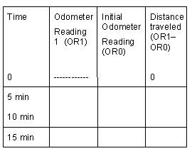
Example 1: As your family is traveling along an interstate, record the odometer reading every 5 minutes. See if a graph of time and distance shows that the relation is approximately linear. If so, write the equation of the line that best fits your data. Predict the time for a journey of 50 miles. What does the slope of the line represent?

Example 2: You light a candle and record its height in centimeters every minute. The results recorded as (time, height) are (0, 20), (1, 18), (2, 16), (3, 14), (4, 13), (5, 11), (6, 10), (7, 8), (9, 4), and (10, 3). Find the line of best fit to express the candle's height as a function of the time and state the meaning of the slope in terms of the burning candle.

General Information
Subject Area: X-Mathematics (former standards - 2008)
Grade: 912
Body of Knowledge: Algebra
Idea: Level 3: Strategic Thinking & Complex Reasoning
Standard: Linear Equations and Inequalities - Solve linear equations and inequalities.
Date Adopted or Revised: 09/07
Date of Last Rating: 06/07
Status: State Board Approved - Archived
Assessed: Yes
Test Item Specifications
  • Item Type(s): This benchmark may be assessed using: MC , FR item(s)
  • Also Assesses:

    MA.912.A.3.12 Graph a linear equation or inequality in two variables with and without graphing technology. Write an equation or inequality represented by a given graph.

  • Clarification :
    Students will use linear equations to make predictions and/or find and use the rate of change (slope).
  • Content Limits :

    Graphs may be located in any of the quadrants.

    Items may include linear equations in various forms, including standard, point-intercept, and point-slope forms.

    In items assessing slope as a rate of change, the slope should be presented as a ratio.

  • Stimulus Attributes :

    Items may be set in either real-world or mathematical contexts.

    Graphics should be used in most of these items, as appropriate.

  • Response Attributes :

    Fill-in response items may require that students provide a slope, the x-coordinate of the x-intercept, the y-coordinate of the y-intercept, or the x-coordinate or y-coordinate of a point of interest.

    Fill-in response items may have a negative answer.

Sample Test Items (2)
  • Test Item #: Sample Item 1
  • Question:

    David is training for a marathon. He writes down the time and distance for each training run and then records the data on a scatter plot. He has drawn a line of best fit on the scatter plot, as shown below.


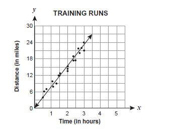
    Which statement best expresses the meaning of the slope as a rate of change for this line of best fit?

  • Difficulty: N/A
  • Type: MC: Multiple Choice

  • Test Item #: Sample Item 2
  • Question:

    Joel graphed the line shown on the coordinate plane below.


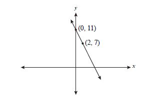
    What is the x-coordinate of the point at which this line intersects the x-axis?

  • Difficulty: N/A
  • Type: FR: Fill-in Response

Related Access Points

Alternate version of this benchmark for students with significant cognitive disabilities.

Related Resources

Vetted resources educators can use to teach the concepts and skills in this benchmark.

Lesson Plan

Spaghetti Bridges:

Students use data collection from their spaghetti bridge activity to write linear equations, graph the data, and interpret the data.

Type: Lesson Plan

Problem-Solving Tasks

Get a Half-life!:

In this activity students are challenged to model a decay function by collecting data from a few trials, graphing the data, and then drawing a curve of best fit. The student must decide which of the equations best fits his/her data.

Type: Problem-Solving Task

Drip, Drop, Drip, Drop:

Students design an experiment to model a leaky faucet and determine the amount of water wasted due to the leak. Using the data they gather in a table, students graph and write an equation for a line of best fit. Students then use their derived equation to make predictions about the amount of water that would be wasted from one leak over a long period of time or the amount wasted by several leaks during a specific time period.

Type: Problem-Solving Task

Unit/Lesson Sequence

Direct and Inverse Variation:

"Lesson 1 of two lessons teaches students about direct variation by allowing them to explore a simulated oil spill using toilet paper tissues (to represent land) and drops of vegetable oil (to simulate a volume of oil). Lesson 2 teaches students about inverse variation by exploring the relationship between the heights of a fixed amount of water poured into cylindrical containers of different sizes as compared to the area of the containers' bases." from Insights into Algebra 1 - Annenberg Foundation.

Type: Unit/Lesson Sequence

Video/Audio/Animations

Fitting a Line to Data:

Khan Academy tutorial video that demonstrates with real-world data the use of Excel spreadsheet to fit a line to data and make predictions using that line.

Type: Video/Audio/Animation

Soybean growth rate response to touch:

A time-lapse video showing differential growth rates for touch-treated seedlings and control seedlings. This would be appropriate for lessons about plant growth responses to environmental stress and graphing growth rate. Plants were grown in a vermiculite soilless medium with calcium-enhanced water. No other minerals or nutrients were used. Plants were grown in a dark room with specially-filtered green light. The plants did not grow by cellular reproduction but only by expansion of existing cells in the hypocotyl region below the 'hook'.
Video contains three plants in total. The first two plants to emerge from the vermiculite medium are the control (right) and treatment (left) plants. A third plant emerges in front of these two but is removed at the time of treatment and is not relevant except to help indicate when treatment was applied (watch for when it disappears). When that plant disappears, the slowed growth rate of the treatment plant is apparent.
Treatment included a gentle flexing of the hypocotyl region of the treatment seedling for approximately 5 seconds. A rubber glove was used at this time to avoid an contamination of the plant tissue.
Some video players allow users to 'scrub' the playback back and forth. This would help teachers or students isolate particular times (as indicated by the watch) and particular measurements (as indicated by the cm scale). A graph could be constructed by first creating a data table and then plotting the data points from the table. Multiple measurements from the video could be taken to create an accurate graph of the plants' growth rates (treatment vs control).
Instructions for graphing usage:
The scale in the video is in centimeters (one cm increments). Students could observe the initial time on the watch in the video and use that observation to represent time (t) = 0. For that value, a mark could be made to indicate the height of the seedlings. As they advance and pause the video repeatedly, the students would mark the time (+2.5 hours for example) and mark the related seedling heights. It is not necessary to advance the video at any regular interval but is necessary to mark the time and related heights as accurately as possible. Students may use different time values and would thus have different data sets but should find that their graphs are very similar. (Good opportunity to collect data from real research and create their own data sets) It is advised that the students collect multiple data points around the time where the seedling growth slows in response to touch to more accurately collect information around that growth rate slowing event. The resulting graph should have an initial growth rate slope, a flatter slope after stress treatment, and a return to approximately the same slope as seen pre-treatment. More data points should yield a more thorough view of this. This would be a good point to discuss. Students can use some of their data points to calculate approximate pre-treatment, immediate post-treatment, and late post-treatment slopes for both the control and treatment seedlings.
This video was created by the submitter and is original content.
Full screen playback should be an option for most video players. Video quality may appear degraded with a larger image but this may aid viewing the watch and scale for data collection.

Type: Video/Audio/Animation

Student Resources

Vetted resources students can use to learn the concepts and skills in this benchmark.

Video/Audio/Animation

Fitting a Line to Data:

Khan Academy tutorial video that demonstrates with real-world data the use of Excel spreadsheet to fit a line to data and make predictions using that line.

Type: Video/Audio/Animation

Parent Resources

Vetted resources caregivers can use to help students learn the concepts and skills in this benchmark.

Video/Audio/Animation

Fitting a Line to Data:

Khan Academy tutorial video that demonstrates with real-world data the use of Excel spreadsheet to fit a line to data and make predictions using that line.

Type: Video/Audio/Animation